Week 5 (Project Management)- Submission Post

Project Management: I have finished my website.

As I went through several stages of coding and got people’s feedback, I realised that there were a few things missing from my high fidelity prototype.

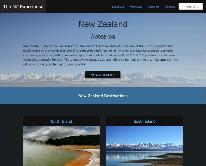
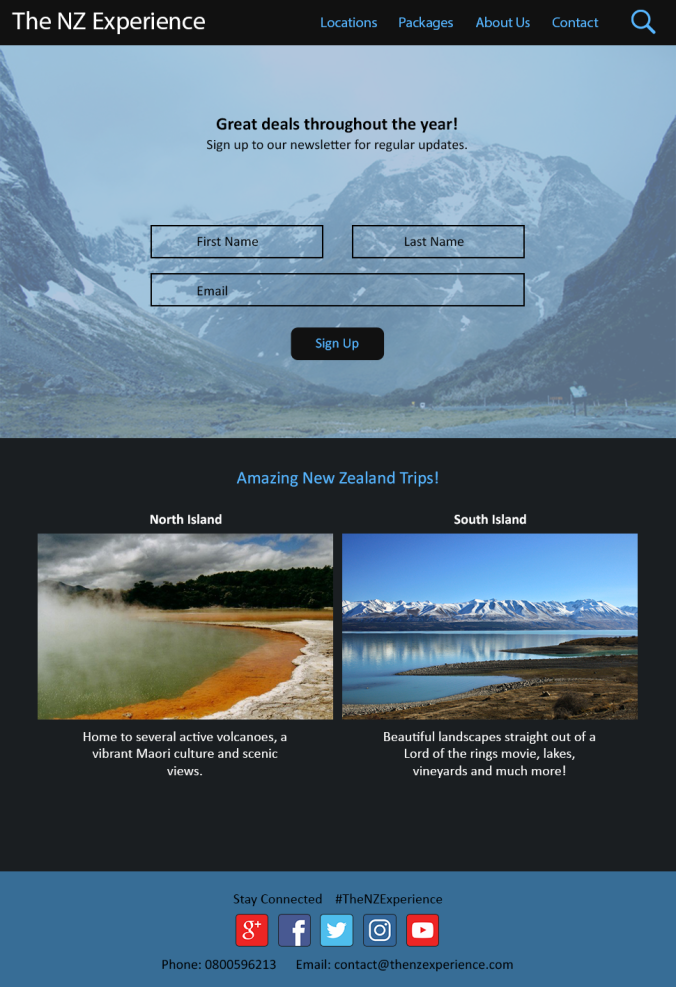
  1. Homepage: I created two new sections- introduction to New Zealand and testimonials section. These are both essential parts of a homepage for a travel agency website. The brief introduction lets people know what they can expect in the rest of the website. The testimonials are also essential since people usually want to read reviews before making a commitment.
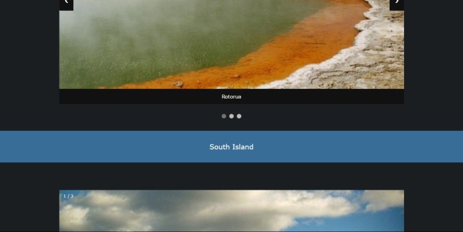
  2. Locations page: I had initially created a grid layout for my images. People had no way of seeing where each place was located in New Zealand. So I have displayed a map showing all the trip locations in New Zealand on the top of the page. Then I have made a slideshow each for the North Island and South Island, which displays the images in a more visually appealing way than the grid.
  3. Packages page: Changed the background image since the one in the high fidelity prototype did not look good when I applied “cover” to it in CSS. The new image also improves continuity.

Here’s a link to my finished website- https://thenzexperience.neocities.org/

Reflection

What did I learn as a result of this assignment/project?

I started out with absolutely no knowledge of coding or building a website. Within just a few weeks I have been able to learn basic html and CSS. I have researched a lot, including things I have not included on my website such as text appearing on top of an image when hovering, shadows, transparent boxes, etc.

I also experimented a little bit with JavaScript and used it for the sliders on my website, after a lot of trial and error- based on research and suggestions from various websites. My JavaScript knowledge is very limited however, I aim to work on it.

I am eager to learn more through continued practice after the completion of this assignment. I did not anticipate how satisfying it would be to build my own website from scratch (even if it is only 5 pages).

What key difficult technical obstacles did you encounter and how did you overcome them?  

Initially, the biggest problem I encountered was that the elements on my pages were not aligning properly. This was because I was not using the skeleton framework properly.

Another issue that I faced was that my website was not covering the entire web page in the browser (all browsers). This was also because of the skeleton framework. The brief explanation on the skeleton website states that all other divs must be in a container. Screenshot_1.jpg

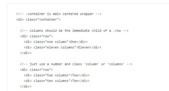
When I put all my divs in a container, the above problem occurred. I fixed it by placing the container inside a section.

Other than the two problems stated above, most of the other problems were minor issues related to margins, typos, etc.

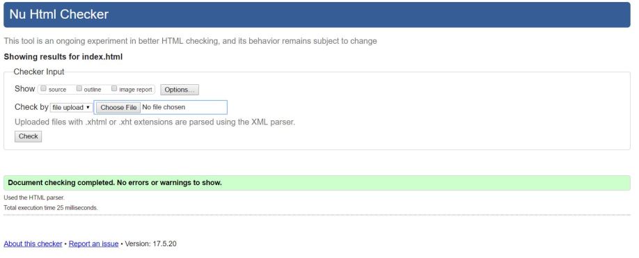
The html and CSS validation tools online helped me to identify errors and correct them. Even something as minor as a typo, or writing “:” instead of “;” can result in an error, and these tools made it easy to spot.

What would you do differently if you had another opportunity to complete this assignment?  

I am very happy with my progress and my initial worry that I would not be able to learn html and CSS fast enough proved to be baseless. I wouldn’t really change anything, but I would have tried to learn more JavaScript from the beginning (even though it is not a requirement for the assignment) in order to make my website mobile responsive.

HTML and CSS Validation

HTML Validation Screenshots for each of my pages-

  1. Home Page (The NZ Experience)- index.htmlindex.JPG
  2. Locations Page- locations.htmllocations.JPG
  3. Packages Page- packages.htmlpackages.JPG
  4. About Us Page- about.htmlabout.JPG
  5. Contact Page- contact.htmlcontact.JPG


CSS Validation screenshot for custom.css which contains all of the css that I wrote for my website.

css validation.PNG

Browser Testing

I tested my website with the following browsers:

  1. Google Chrome Version 58.0.3029.110 (64-bit) on Windows 10
  2. Mozilla firefox 53.0.2 (x64 en-US) on Windows 10

Summary:

Each webpage was nearly identical on both browsers. The only minor difference is that the grey placeholder text in the forms was very slightly lighter in Mozilla Firefox.

Skeleton framework works on both browsers and the different divs resize appropriately when the browser is resized.

Screenshots

INDEX/ HOME PAGE

Google Chrome                        Mozilla Firefox


LOCATIONS PAGE

Google Chrome                       Mozilla Firefox

PACKAGES PAGE

Google Chrome                        Mozilla Firefox


ABOUT US PAGE

Google Chrome                               Mozilla Firefox


CONTACT PAGE

Google Chrome                                    Mozilla Firefox

Week 4- Project Management

Project Management:

I set aside an hour on Thursday and two hours on Sunday to work on my website. I am now becoming better at identifying mistakes and errors, and am pretty confident when it comes to html and css.

I worked on-

  • Fixing the Navigation bar on the top while scrolling. I couldn’t get it to work even though I set the position as fixed, and width 100% in my css. It turns out that I forgot to put a semi-colon after the 100%. Also, I did not have z- index in my css. This is a link that I referred to while fixing my navbar- http://sixrevisions.com/css/fixed-navigation-bar/
  • Making sure that my html and css are readable.
  • Getting people’s opinions about my website and making changes to it-
    • Changed the placeholder text in the “Message” and “Email” fields of my contact form.
    • Removed the transparent box from my homepage1.JPG
    • Added a more suitable background image to the packages page.Capture.JPG
  • Browser testing on Mozilla Firefox and Google Chrome. https://karlwebmedia.wordpress.com/2017/06/01/browser-testing/
  • CSS and html validation: I did not expect to have any errors in my html, but it turns out I did. They were mostly minor issues like no spaces, no alt text for images, etc which have now been fixed. I was having a few minor problems with the css validation as well (mostly typos) but I have fixed them. Click here to see screenshots of my final, error free CSS and html validation check- https://karlwebmedia.wordpress.com/category/html-and-css-validation/

Week 3- Project Management

I completed all of my tasks for the week, and am moving closer to a finishing the website.

Project Management: Tasks for the week-

  • Redesigned the locations page based on recommendations. I added a map of New Zealand in the beginning which shows locations of destinations.
    I also changed the way I displayed images of locations- I created one slideshow each for the North and South Island destinations using html, css, and javascript.
  • Html and CSS for the Locations Page.
  • Html and CSS for the Packages Page.
  • Changed the appearance of the testimonial slider (home page) to something more simple and less blocky looking.
  • Changed the colour of pages on the navbar when hovering over them and when active.
  • Linked all the pages together

Screenshots:

Locations page- map and content.  Also, you can see that the active page is indicated by a change in colour on the nav bar

Screenshot_1.jpg

Slideshows for North Island and South Island  Locations-
Screenshot_2.jpg

Screenshot_3.jpg

Screenshot_4.jpg

Packages Page-

Screenshot_5.jpg

Homepage (New Testimonial Slider)-

Screenshot_6.jpg


My plan for the coming week-

  • Fix Navigation bar on the top while scrolling
  • Go through my html and css to make sure it can be easily understood by anyone else who may read it.
  • Make minor improvements to my pages as I think of them.
  • Get people’s opinions about my website and make changes as i see fit.
  • Browser testing
  • CSS and html validation

Week 2- Project Management

Week 2 turned out to be quite productive! I finished way more than expected given my coding inexperience.

Project Management

My initial plan for week two was to work on the second page of my website- html and css, and improve/modify my home page.  I allotted an hour a day to researching how to add certain elements such as sliders and low opacity boxes to my website. Since my weekdays were pretty busy, I decided to spend 6 hours on Saturday and Sunday on coding for the second page.

To sum up- I spent an hour each day (Monday-Friday) on research, and 6 hours on both Saturday and Sunday coding.

I underestimated my coding speed and was able to complete both my Contact and About Us pages.

contact.jpg

Contact page

As you can see in the screenshot, my contact page is quite simple (exactly like this page in my prototype). I did not want to have any unnecessary background image or other elements. I want the page to be simple, easy to understand and uncluttered.

I showed last weeks home page to a few people and received some recommendations from them. I have incorporated a few of these changes on the page.

About Us page

about1.jpg

about2.jpg

Changes to the home page

  • I added a section on the top of the home page (directly under the navbar) which provides a little information on New Zealand. The information/ text box is not mobile responsive. I will work on making individual elements mobile responsive once I have finished the desktop versions of all the pages. I also added a “View Our Deals” button.

home1.jpg

  • I changed the look of the destinations section on the page, aligning the images properly and adding dark grey backgrounds to the North and South Island titles.

home2.jpg

  • I added a “What Our Clients Say” section (testimonials). I expected a slider to be fairly easy to create but it took me a while to get this working. This section is not mobile responsive. home3.jpg


  • The good news is that I finally managed to get the background images for two of the home page sections to appear. I had named one of my “section” classes something other than- section. Apparently this was the problem. home4.jpg

I think I’ve learned quite a bit this week, and did not anticipate how satisfying it would be to see my code turn into actual web pages.

Week 1- Project Management

Over the past week, I have started working on the html and css for my website. I’m completely new to coding, so I started by going through lynda and codeacademy resources.

Here is a link to the sitemap I will be using to create my website-

https://karlwebmedia.wordpress.com/category/sitemap/

Project Management:

The first step that I took was to organise tasks for the week. My aim was to finish the basic structure and stlying for the first page (home page) of my website.

I spent 1-2 hours everyday learning how to code, and another 2 hours daily experimenting with everything i learned and trying to create the home page.

I worked on the html and css for the content on the home page, as well as the navbar, footer and greycontainer which will be applied to the subsequent pages.

Progress and Experience:

I have finished the html structure and css for the web page, but had a few issues which I hope to get solved in class this week.

I had a little difficulty with aligning certain items (search) on my nav bar but eventually figured it out. I still have to make the navbar stay fixed on top of the page while scrolling. I also created the form which enables people to subscribe to a newsletter.

I had alignment issues with this form, since I didn’t wish to use all twelve skeleton framework columns. Skeleton seems to be arbitrarily aligning my form to the left, while I want it to be centered.

I also cannot seem to get the background image to appear behind the form.

navbar and form.jpg

As you can see in the above image, the form is aligned to the left, and the background image is not visible.

On scrolling down, you come to the next div in which I am once more unable to move the images to the center of the page.

trip location brief.jpg

At the bottom of the page is the footer.

footer.jpg

Reflection


This assignment has taught me a lot about website design. We started off by using the box model to figure out how website layouts were created with div blocks, etc. I also learned how to create a sitemap, and how to use Invision to create high and low fidelity prototypes. Invision is a great prototyping tool and makes the process very simple with it’s sync from Photoshop option.

I learned how to design a website on Photoshop and the basic rules that must be followed such as- consistency across pages, logical placement of items on the pages and using a call to action on the landing page. I also learned how to create a mobile version of the website.

I realised that my initial thoughts regarding how the website should look were not the best, and that it takes constant improvements and rethinking to make a good website. Throughout the entire process of creating mockups, low fidelity and high fidelity prototypes my website has evolved significantly. I have altered the appearance of the pages (font and type size, added a search button to the navigation bar,etc) in my high fidelity prototypes.

The main obstacle that I had to face was ensuring that all my pages had continuity. Initially all my pages did not match up as some were very image based and others text based. I solved this by using a blue footer as well as a blue panel (for the page title) on the top of each page. I also added images to the relatively text heavy pages. After giving it some thought, I realised that the contact page looked better without an image as it would create a cluttered look and divert attention from the contact form.

This assignment has given me insight into the process which one must go through in order to design a website.