Trafalgar Travel
Trafalgar is a travel agency which offers trips to over 230 destinations in – Europe, North & Central America, South America, Africa, Middle East and Asia.
Background (Landing page):
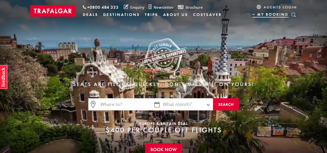
A video has been used as a background which is distracting and along with the white colour, makes the text on top of it difficult to read. I will use a similar layout but will use an image instead and ensure that the font is clearly visible.
Navigation Bar:
The homepage of the website has a transparent menu which contains all the essentials- deals, destinations, trips, about us, and cost saver. It also has details such as a phone number, enquiry, newsletter and brochure. As such the menu is very comprehensive and links to every possible function including managing your bookings, without being cluttered. I also like that there are no lines/ visible boxes around each menu item.
It would have looked more visually appealing if there was an opaque navigation bar rather than a transparent one, in order to lend it some structure. I will be using a black or dark grey navigation bar for my website.
A problem with the navigation bar is that it changes while scrolling and also when on other pages.
Navigation Bar while scrolling on the homepage:
When scrolling down, the transparent navigation bar becomes white and the layout changes. All the menu items go into a menu burger.
When you click on the menu, a box pops up and covers the page, with all the menu items in it. This is inconvenient and does not look very visually appealing. For my website I will keep a navigation bar permanently fixed on the top (no pop up boxes). This will be consistent while scrolling as well as from page to page, and the appearance will not change.

Navigation Bar while on pages other than the home page:

There is a major change in the navigation bar and all the menu items are rearranged. There is no consistency and this will make navigation process unpleasant for the user.
Offers written on top of click-able images:

I like that the website is very image based, which makes it more pleasant to look at and easier to navigate. The images can be clicked on to view the offers which are available. I will also be using similar visuals to display offers on my website.
Social media icons/links:
Trafalgar’s website has social media icons to the right of the page which remains there even while scrolling. This is a very good feature and gives high visibility to these icons, possibly increasing visits to Trafalgar’s social media pages. It does not get in the way of the other content or make the web page look cluttered. It is very convenient for users, as the links to the social media platforms are there for them to click on regardless of their position on the page.
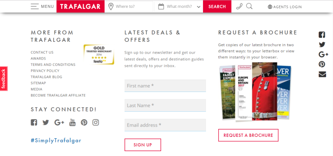
Bottom of the page:
At the bottom of the home page, Trafalgar provides icons/links to its social media pages again along with #SimplyTrafalgar to encourage engagement on social media. It also has a form that a website visitor must fill in to get newsletters with details of latest offers. There is also the option to request a brochure. I like the font as well as the neat appearance. I will however be using the form on the top of my homepage and the entry fields will be stretched horizontally rather than vertically (in the image). As soon as visitors come to the home page they will see current offers as well as the option to sign up to receive updates on latest offers. Users are always looking for good deals and offers on trips, so it makes sense to have this on the top of my homepage.
Conclusion:
Trafalgar’s website looks good visually, but has a few problems that might make navigation more difficult- inconsistent/ changing navigation bar, popup menu covering the page, low visibility of text in certain areas, etc.
The use of images to display offers, permanent social media icons along the side of the page, font, sign up form are some of the positives.
100% Pure New Zealand
http://www.newzealand.com/int/
Navigation Bar:
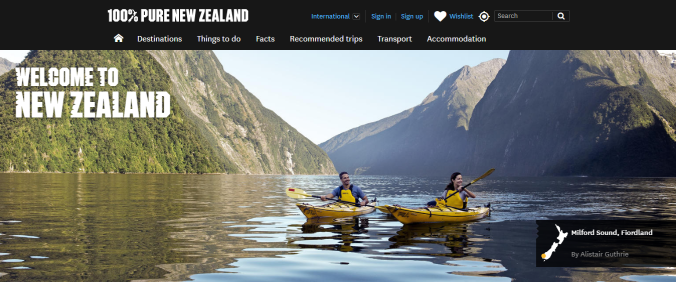
As mentioned in my critique of Trafalgar’s website, and opaque navigation bar would be more visually appealing and would give the page a more structured appearance. 100% Pure New Zealand has done exactly that, with a dark grey navigation bar. The contrast between the white font and dark grey navigation bar is visually appealing. However, the navigation bar disappears once you start scrolling. This is a limitation in terms of convenience to the user/ website visitor.
The navigation bar for my website will remain constant and will not disappear or change while scrolling.
Background (Landing page):
The use of an attractive image for the background is a good idea. It also contains a little box towards the bottom right of the image specifying the location the image is depicting (Milford Sound).
My website will have a similar attractive image, but on top of the image I will have a simple form and a line or two telling visitors to subscribe to our newsletter to get updates on great deals and offers, which is one of the first things people wonder about when planning trips.
Locations:

The locations page on the website has a collage of images (representing locations) which can be clicked on to get more information on trips to those areas. Each image has text on it (Auckland, Bay of Plenty, The Coromandel,etc). When you hover the cursor over the image, a short description of what the location is known for (Rotorua in the screenshot above) pops up. This way the user can see a brief of what will be on the next page before deciding to visit it. This is a visually appealing user friendly way to structure content.
I will be using similar visuals on my locations page.
Search for activity:

The homepage also has the option to search for activities in different regions in New Zealand. This is very convenient for users who will of course want to know which activities they can partake in, in which locations and at what prices.
Wishlist:
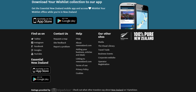
The bottom of the homepage has a link to download their app in order to create a wishlist. This will not only spread awareness about the app, but will also be of use to people who can create a list of things they would like to do and places they would like to visit. The text is not overdone (just 3 lines) and the visual elements are well spaced out. However, it would have been better if they had built the wishlist function into the website itself.
Contact details:
At the bottom of the page there are links to their social media, along with a contact us section. The contact us section of text should have included a few basic details such as a number or email so that the website visitor does not have to go to another page to view it.
The contact section on the bottom of each page on my website will include the phone number and email, as well as links to The NZ Experience’s social media.
Conclusion:
100% New Zealand has a great website when it comes to visuals as well as ease of navigation and use. It looks good, contains a lot of images and minimal text, has useful tools such as “search for an activity, etc. However it has a few areas in which it could be improved- the navigation bar must remain fixed and not disappear while scrolling, contact number and/or email should be provided at the bottom of the page.
